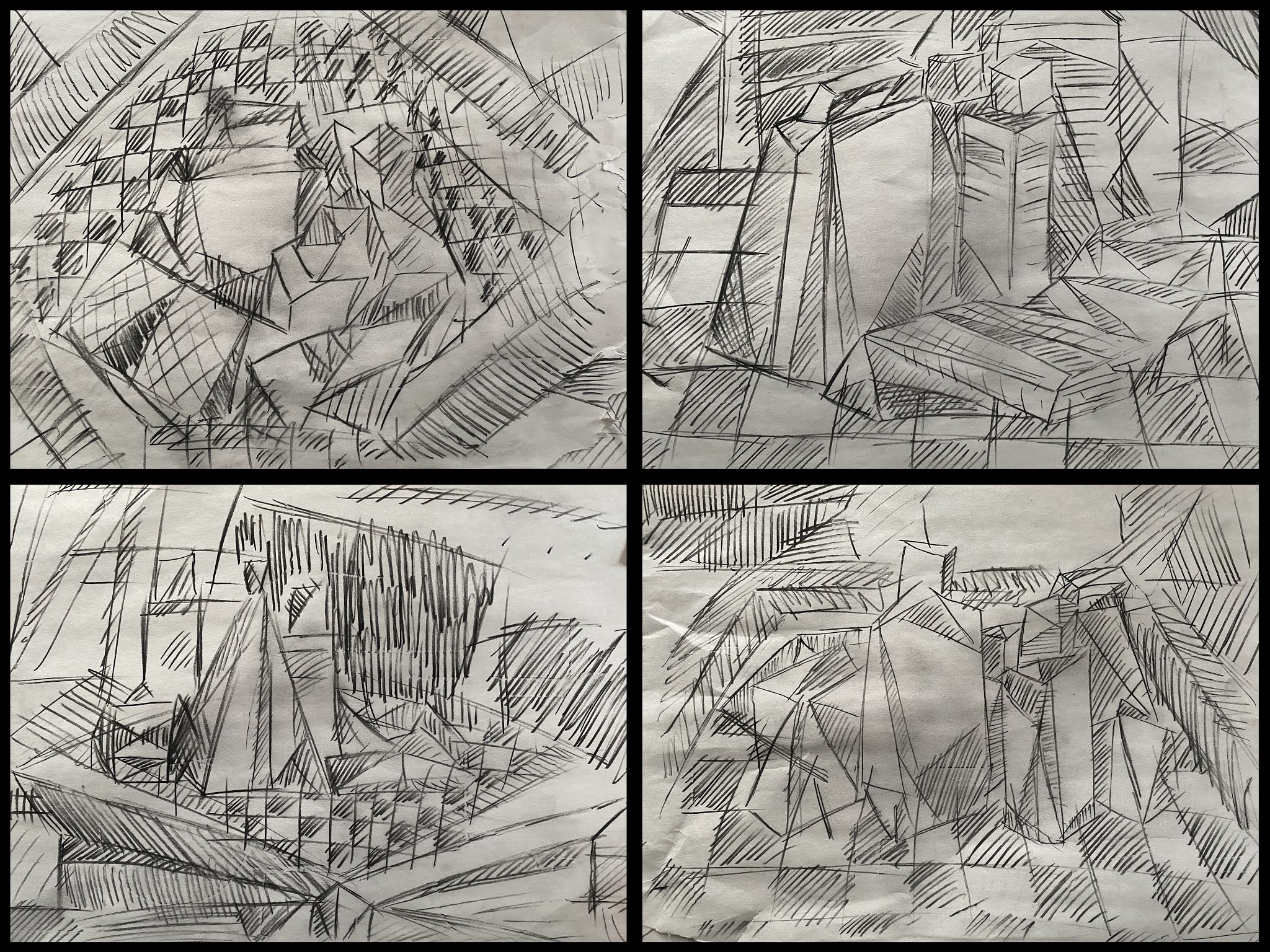
I really like your cross hatching, it gives the space more dimension and I can tell what planes go in what direction. It does seem to have minimal tone range though, so adding some solid blacks or gradients in there might give the space more to look at. -Pan
Teo, I like the degree of simplification here, and I think especially in the one on the lower right you've broken the objects up nicely into faceted shapes. I would definitely go in and add a greater range of values before you start on the collage, since now it looks relatively homogeneous. Also, it looks to me like rather than drawing (i.e, inventing shapes for) the invisible space around the objects, you've drawn more objects (i.e., table, floor, wall, etc.). I could be wrong, but that's what it looks like. Why don't you try extending some of the lines you have in your objects out into the space. With enough of these you'll end up with geometric shapes, which you can then go in and render slightly volumetric. While the loose hatch makes everything look really dynamic, I think for the sake of the collage you might want to make things a bit clearer (i.e., more solid) -- at least some of the shapes.
I really like the difference sized cross-hatching you used. I think its cool. But because the lines of all your cross-hatching looks to be the same distance away from each other, it kinda disorients me a little. I think if you played with the darkness or space between the cross-hatching (so making the hatching closer together) would be nice.
I really like your cross hatching, it gives the space more dimension and I can tell what planes go in what direction. It does seem to have minimal tone range though, so adding some solid blacks or gradients in there might give the space more to look at.
ReplyDelete-Pan
Teo, I like the degree of simplification here, and I think especially in the one on the lower right you've broken the objects up nicely into faceted shapes. I would definitely go in and add a greater range of values before you start on the collage, since now it looks relatively homogeneous. Also, it looks to me like rather than drawing (i.e, inventing shapes for) the invisible space around the objects, you've drawn more objects (i.e., table, floor, wall, etc.). I could be wrong, but that's what it looks like. Why don't you try extending some of the lines you have in your objects out into the space. With enough of these you'll end up with geometric shapes, which you can then go in and render slightly volumetric. While the loose hatch makes everything look really dynamic, I think for the sake of the collage you might want to make things a bit clearer (i.e., more solid) -- at least some of the shapes.
ReplyDeleteI really like the difference sized cross-hatching you used. I think its cool. But because the lines of all your cross-hatching looks to be the same distance away from each other, it kinda disorients me a little. I think if you played with the darkness or space between the cross-hatching (so making the hatching closer together) would be nice.
ReplyDelete-Kaayla
Delete