Monday, May 7, 2012
Grades
Apologies for the delay in submitting my grades! I sent them in on Saturday, so you should be able to access them online now. Please let me know if you cannot.
Tuesday, May 1, 2012
Group portrait and thanks
 |
Thank you all for a wonderful year! What a remarkable group of talented and intelligent people you are. You will be missed. Don't forget to drop by from time to time to say hello. I look forward to seeing your work develop over the years to come!
And have a wonderful summer!
Friday, April 20, 2012
Portfolio Deadline
Dear class:
As per your request, I'll be grading portfolios before our final class of the semester so you can take them with you at the end of that day. My grading day (and therefore your deadline to turn them in) will be Sunday, April 29th at 3pm. Please plan to leave both your portfolio and your notebook in the classroom racks clearly visible and clearly labeled with your name at or before that time.
Your portfolio should contain all the homework drawings from the semester except for the midterm and final projects, which are graded separately. Be aware that a sloppy portfolio will affect your grade, as will a missing assignment.
Independent Study Projects: If you did an independent study project at the end of this semester, this should also be included either in or alongside your portfolio.
Here's the list of assignments from this semester:
1. Cubist collage
2. Paper cut-out drawing
3. Monochrome pastel
4. Altered masterpiece pastel
5. Movement drawing (or flip book)
6. Informational image drawing
7. Unconventional tool drawing
Monday, April 16, 2012
Homework: Final Project
Your homework for next week is to begin working on your final scroll drawings. Please take this opportunity to do a LOT of experimentation with different media, tools, and methods of application. I expect to see lots of notebook activity around this project when I check your books on the final day of class!
AND DON'T FORGET TO PICK UP YOUR SCROLL PAPER IN 102C TOMORROW (TUESDAY) SOME TIME BEFORE 3:30PM.
AND DON'T FORGET TO PICK UP YOUR SCROLL PAPER IN 102C TOMORROW (TUESDAY) SOME TIME BEFORE 3:30PM.
More Works on Paper by Kandinsky
Dear class,
Below are a few more images for your perusal. I hope looking at Kandinsky's works on paper today will inspire you to always look in to famous painters' works on paper! Too often, we only know artists by their paintings.


Below are a few more images for your perusal. I hope looking at Kandinsky's works on paper today will inspire you to always look in to famous painters' works on paper! Too often, we only know artists by their paintings.


Monday, April 9, 2012
Homework Assignment #10
UNCONVENTIONAL TOOL DRAWING:

Taking our cues from Nam June Paik's "Zen for Head" (pictured above), in which the artist used his own head as a brush for his sumi ink drawing, this week's assignment is about exploring alternative ways of making marks with ink. Begin by doing some experiments with various kinds of objects or parts of your body and seeing what kinds of marks each one makes when dipped in ink and applied to paper.
Using sumi ink and your chosen "tool," make an abstract drawing using only this tool. You may apply the mark just once (as in Paik's drawing) or a number of times, using layering and mark density to create an interesting composition. Whatever you do, be sure to practice your mark a lot on scrap paper before applying it to your final drawing, and give great consideration to its (or their) placement on the paper. Keep Chinese calligraphy in mind as you go about this, and recall the importance of "emptiness" in the Chinese and Chinese-inspired images we looked at today.
Below is another unconventional tool drawing, this one by the artist Robert Rauschenberg. His tool was a tire.

Saturday, April 7, 2012
Final Project Guidelines and Samples
PLEASE NOTE: Not one, not two, but THREE relevant posts below!
Dear class,
Here are the guidelines for your final drawing project, which will be due on Monday, April 30th (our last day of class). Following the guidelines are some samples of previous students' work.
SCROLL DRAWING:
For this project you will be creating a “scroll” (or a drawing with dimensions that suggest a scroll) that is a visual interpretation of either a piece of music or a literary work of fiction. Beginning with a piece of music or a book that holds some personal significance to you — and preferably one that you’ve listened to or read again and again so that you’re intimately familiar with its nuances — the challenge will be to translate the invisible into visual form without relying on representational imagery. In other words, the idea is not to illustrate a narrative but rather to convey through the language of abstract form the essence of a non-visual work of art.
On the scroll format:
The scroll format is important for several reasons. First, because it is long and narrow, it requires that the viewer “read” it from one end to another as he/she would a piece of writing. This is a nice way to incorporate the element of time into a drawing (and time is the “medium” through which music and fiction move). As the viewer scans your piece, the development of the music or narrative and its temporal changes will be evident. Second, when oriented horizontally, the elongated format strongly suggests a bar of musical notation (as in a score). By the format alone you will already be suggesting time (or temporal succession).
The aspect ratio of the format will be 1:8. I will be providing each of you with a piece of 10” x 80” sketch vellum the week before the project deadline. If you’d like to use a paper or surface other than the one provided but with the same dimensions, you may do so.
You may choose either the horizontal or the vertical orientation for your scroll. Be sure to give this some thought, since the different orientations read very differently.
Selecting your piece of music or literature:
Because the idea is not to rely on representational imagery to illustrate a story, it is suggested that if you are working with music you select a piece without lyrics. However, if you decide to use a song with lyrics you’ll have to make an effort to stay focused on the formal and emotional content of the music rather than on its narrative content. Working from a piece of literature will make this challenge slightly greater and will require that you stay focused on the “shape” of the narrative and on representing your characters with abstract forms.
Analyzing your selected piece:
After selecting your piece of music or literature, the next step will be to analyze it (literally: to break it apart) by separating its different components conceptually. Drawing/sketching is an excellent way of figuring things out conceptually.
a. Instruments or characters: If working with music, your first step will be to figure out what kinds of instruments are being used to make the different sounds and to make a series of sketches exploring different kinds of marks to convey each sound. If working with fiction, your first step will be to come up with a “cast” of abstract forms to represent your major characters.
b. Overall structure: Next, you’ll want to make a sketch or diagram that breaks the piece down into its various “movements.” For example, it might start off slow and calm, then progress into something loud and dramatic, then return to slow and calm (three movements). In fiction, this overall structure is generally referred to as the “arc of the narrative.”
c. Emotional range: Finally, you’ll want to think about what kinds of emotions your piece evokes and come up with a palette that accurately reflects them.
Choosing your materials:
You may use any drawing materials (including ink washes and other watery media) for this project. However, restraint is advised! More than anything else, you will want your drawing to be a coherent piece of visual art that can stand alone (i.e. without the music or story that inspired it).
Presentation:
For our final class of the semester we will be doing an all-day critique of your scrolls. At the beginning of your presentation you will have the option of either playing a few minutes of your piece of music or briefly summarizing your book.
Some samples of student work from past years (in the following order: Alan Tung, Jessie Tsai, Darragh Rosenberg, Kanae Hatanyama, Yasmin Malki, Inkyung Park, and Alexi Burns) (Click on images to enlarge):


Friday, April 6, 2012
Materials for Monday's class
PLEASE NOTE: Two relevant posts below!
Dear class,
Please bring with you on Monday a bottle of Sumi ink and at least one brush. You may also want to bring an ink pen with various tips, but this is optional.
Unless you'll be pursuing an independent study project, please also bring a magazine or newspaper clipping of a recent event that captivated your attention. Stories without accompanying pictures are preferable.
Monday, April 2, 2012
New Classwork Policy
IMPORTANT NOTE: Please see post below for this week's homework assignment!
Dear class,
I've decided to issue a new policy for our in-class studies that I'm calling the Independent Study Option. For those of you who are feeling frustrated with the issue-specific nature of our short in-class studies, I'm going to give you the option of pursuing a set of longer-term drawings (i.e., drawings you can continue to work on from one class period to the next) for the remainder of the term. For these more in-depth pieces you will be permitted to pursue any subject -- abstract or representational -- and to develop it in any medium of your choosing. I will continue to give a brief presentation before each drawing session, but its implementation in class work will from now on be optional.
If you are interested in pursuing an independent drawing project, please bring to class next week several sheets of watercolor paper (22" x 30" -- the standard size, which you can easily purchase at DaVinci) or some other drawing surface so that you'll have something nicer to work on than your newsprint. You can store these drawings in the classroom racks alongside your newsprint pads.
I look forward to seeing some exciting work emerge over the course of the next few weeks. I will, of course, be available for feedback as always. The idea here is to give you more freedom to challenge yourselves in new ways for the rest of the year. BEING BORED IN DRAWING CLASS IS NO LONGER A VIABLE OPTION! Please use the remaining class time to work on artwork you care about deeply and will be happy to save.
Homework Assignment #9
EXPLORING ABSTRACTION WITH "INFORMATIONAL IMAGES":
This week’s assignment is about exploring an approach to abstraction that takes its cues from the world of information. “Informational images” are non-art images that can be anything from maps, charts, diagrams, and scientific photographs to musical scores and other forms of written notation. Your task for this week is to make an abstract drawing that is based on one (or a combination) of these images.
Source material: Using either the web or the library, begin by looking at a variety of images that fall outside the category of art and somewhere inside the category of information. Some suggestions to begin with are: astronomy photographs taken by the Hubble Space Telescope, microscope images of cells, molecules and bacteria, maps of any kind, Or the scientific photographs of the photographer Felice Frankel. Since most of these images will be visually abstract (although they certainly represent various things), what you’re looking for are intriguing shapes, lines, forms, rhythms, textures, etc. From these images, select between one and three to base your drawing on.
Your drawing: Using the source material as a point of departure, make a drawing that incorporates the forms from your image/s into a dynamic and interesting abstract composition. You may, of course, deviate substantially from your source material; feel free to select, omit, distort, alter, exaggerate, colorize, etc. At a certain point you may want to abandon the source material altogether and let what’s happening in your drawing determine your moves. Be sure to bring an image of your source material to class next week so that we can understand your process and the evolution of your drawing.
Materials: You may use any materials for this assignment, and your drawing can be in either grayscale or color.
Saturday, March 31, 2012
Photographs for Monday's class
NOTE: TWO RELEVANT POSTS BELOW!
Dear class,
Please bring with you on Monday several (between 1 and 3) photographs of a favorite place -- either one you've been to personally or one you've always wanted to visit. Your photographs may be landscapes, cityscapes, or any combination thereof, but they should be "scapes" -- i.e., representations of a specific place with distinct geological or man-made features. A single photograph will suffice, but the more visual information you have about the place the better off you'll be for our in-class work. The photos may be either black and white or color.
Monday, March 26, 2012
Follow-up to Critique Day
[Important note: Please see post below for next homework assignment!]
Dear class,
Thanks to all of you, today's critique was another success. I saw a lot of great work, and I really appreciate that so many of you took such a personal and deeply felt approach to your drawing. Because of all your thoughtful contributions, I didn't have to say much today -- but please do let me know if you'd like more feedback from me on your project. I'd be happy to provide it.
Homework Assignment #8
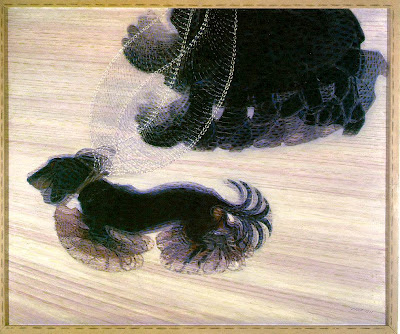
In preparation for this week's homework assignment, which appears at the end of this post, here are a few images to refresh your memory about depicting movement in still images (i.e., drawings and paintings). The works below are all by the great Italian Futurist Giacomo Balla.


DEPICTING MOVEMENT IN STILL IMAGES:
This week’s assignment is about further exploring ways of conveying movement in drawings. You may choose either of the following approaches:
(1) Drawing from film: Make a drawing based on a selected sequence in your favorite film. Because you’ll want to watch the sequence a number of times at various speeds, be sure you have the proper equipment (i.e., don’t work from memory).
After selecting a good film sequence that you would like to interpret graphically, begin by making a series of quick studies in your notebook. Just as we did in class, concentrate on the way your line quality (or the quality of your marks) reflects the qualities of the various movements your sequence involves (i.e., quick and frenetic, slow and graceful, jumbled and chaotic, precise and mechanical, etc.). You may want to experiment with various drawing materials and colors before beginning your final drawing.
When you have a good sense of how you want to compose your piece, make a drawing on your regular homework paper. Your final piece can be as abstract as it needs to be, as long as it is an interpretation of the movement you observe in your film sequence.
(2) Flipbook: Make a flipbook that creates an illusion of movement as the viewer flips through its pages. Taking some cues from William Kentridge, a very good approach to this is to begin with a used paperback book (you can buy these on the street for cheap or at used bookstores). Be sure to “test” your book before purchasing it (i.e., make sure it’s the kind of book that allows for easy and fluid flipping.) The idea is to use the existing pages creatively, drawing over and around the text however you see fit.
Your sequence of drawings can be abstract (as in a “dancing” line or shape), representational (as in a leaping ballerina), or any combination of the two. Whatever you choose to do, be sure the sequence is long enough to create a rewarding illusion of movement for the viewer. Please keep in mind that your flip book should be a work of art – i.e, it should be something more than the kind of doodle one does in one's algebra text book!
Monday, March 19, 2012
Critique Day for Midterm Projects
Dear class,
As the deadline for your midterm projects is next Monday, March 26th, we will be conducting an all-day critique on that day. It will be the same kind of thing as we had at the end of last semester, so please come prepared for a very full day. Several things of which to take note:
1. Sorry -- no donuts this time! I only do that on the last day of the semester. Please come prepared with your own lunch and snacks. Any breaks we take will be very brief.
2. Each of you should be prepared to give a brief presentation about your drawing before we open the forum for group feedback. Things to consider talking about include: Did you use photographs or other source material for your drawing? What kind of information did this source material provide for you in your drawing process? What drawing materials did you use? Did your ideas change at all during the drawing process? What kinds of difficulties did you encounter along the way? How satisfied are you that your drawing achieved what you set out to achieve?
3. The more generous we all are with our comments, the more rewarding the day will be for everyone. Please make every effort to contribute your feedback to everyone. As with last semester's final, I will be sitting in the audience rather than leading the critique.
4. Out of respect for your fellow students, please refrain from drawing in your notebooks, texting, playing digital chess, or anything else during the presentations. These things are enormously distracting to the person speaking in front of the class.
Good luck on your projects!
Tuesday, March 13, 2012
Extra Credit Assignment
(See below for information about midterm project.)

Dear class,
As I mentioned on Monday, I'd really like you to see Sarah Sze's show at the Asia Society Museum before it closes on March 25th. Sze is a terrific young(ish) artist whose work will inspire you to think about drawing in new ways.
The Asia Society Museum is located at 725 Park Avenue (at 70th Street). It's open Tuesday–Sunday, 11:00 am–6:00 pm, with extended evening hours Fridays until 9:00 pm.
DON'T FORGET TO BRING YOUR SVA I.D! The show will cost you $5 with your card.
For more information, see here: Asia Society Museum.
If you go (strongly encouraged!), you can simply tell me a bit about your impressions of the show to receive extra credit.
Monday, March 12, 2012
Deadline for Midterm Projects
Dear class,
As I said earlier today, your midterm projects will be due on Monday, March 26th. On that day we'll critique all the drawings.
Next week we will be studying movement, and I will be giving a brief (one-hour) assignment for you to complete in addition to the class work. Please keep this additional assignment in mind as you plan your drawing time over the course of the next two weeks.
IMPORTANT NOTE: The midterm project will count for the bulk of your grade for the spring semester. As with last semester's final, I expect you to put in between 20 and 30 hours on this drawing.
Thursday, March 8, 2012
Studio Day on March 12th
Dear class,
As you all know, we'll be having our "studio day" on the first Monday after spring break. This is the day when we'll be working with the models and projections for your midterm projects. Please come to class prepared with the following items:
(1) A digital camera. If you don't have one and you plan to use the models and projections, please be sure you can borrow one from a classmate who will be bringing one. It's important that we get good quality photographs, so don't rely on your cellphones for this.
(2) Your notebook. If you'll be working with the models and projections, you should come to class prepared to show the models what you have in mind. Remember: An image is worth a thousand words! It's much more efficient to show the models what you have in mind than it is to explain it verbally.
(3) Your drawing materials and paper for the project. Especially if you don't plan on using the models and projections, you should come to class prepared to get to work on your project. If necessary, we'll send you to another room where you can work without being disrupted.
Monday, February 20, 2012
Homework Assignment #7, due Monday 2/27
ALTERED MASTERPIECE:
This week's assignment is to make a pastel drawing that uses color to change the meaning or psychological mood of a famous painting. Begin by selecting a well-known painting that holds some personal interest for you. Be sure to make a nice digital print of your selected piece (preferably from a high-quality reproduction) so that you're not working from a computer screen.
Next, study the image for a while and imagine how your "read" of the painting might differ if the color were different. For example, if your selected piece is Van Gogh's Starry Night, imagine how you might feel about the piece if the sky were bright orange instead of blue, if the stars were blue instead of yellow, if the trees in the foreground were red and green, etc.
Using your chalk pastels and whatever kind of mark-making approach (including, if you're feeling ambitious, Seurat's "Pointillism"), make a drawing that re-interprets the painting by changing its color scheme significantly. You may want to consider "inverting" the colors -- i.e., changing each color into its complement. Or, if you prefer, alter the palette to emphasize a dominant hue not seen in the original. However you choose to approach the assignment, concentrate on "re-creating" the painting in such a way that you give it a new dimension of meaning that feels uniquely your own.
You may use however many or few colors you want to for this assignment, but complex (i.e., blended) colors tend to be more successful than simple ones.
Be sure to bring your print of the original painting to class so we can look at it during our critique.
Saturday, February 18, 2012
Color photograph for Monday's class
Dear class,
Please bring with you on Monday a color photograph (or print) with an interesting composition and a range of hues. The subject can be anything whatsoever, but it should be something that holds some personal significance to you. We will be using this in our class drawing session.
Please bring with you on Monday a color photograph (or print) with an interesting composition and a range of hues. The subject can be anything whatsoever, but it should be something that holds some personal significance to you. We will be using this in our class drawing session.
Tuesday, February 14, 2012
Homework Assignment #6, due Monday 2/20, and notebook reminder
First phase: Writing on the Body:
Your assignment for this week is to select a text for your mid-term project and to create a graphic arrangement that will be “camera-ready” so that I can convert it into slide form. Before doing anything, be sure to read over the entire project description (see post below).
Your text:
Once you select a text for the project, you’ll need to arrange it graphically (with or without additional “purely graphic” elements) on a regular sheet of paper (i.e., 8.5” x 11”). You can do this either on the computer or by hand. If necessary, you may bring in several alternatives; I will convert into slides up to three texts per person.
Please note that even if you will not be using the projection approach for this project, you still need to show me a sketch of what you will be doing. The main thing is to begin thinking and planning now so that you'll be ready to get to work immediately after spring break. You can do this in your notebook, as I will be checking those next week.
Midterm project
Below are the guidelines I gave you in class this week for your midterm project. Please take some time to read them over thoroughly.
NOTE: The exact deadline is yet to be determined. Projects will be due some time after spring break.
WRITING ON THE BODY:
This assignment is about exploring the formal possibilities and conceptual implications of a mode of self-expression that can be considered the most primal form of mark-making: writing on the body. While there are many different ways to approach this project, a good place to begin is a consideration of today’s tattoo culture, in which people have highly personalized words and images inked indelibly onto their skin—with results that can be both astonishingly beautiful and thoroughly grotesque. A less familiar but equally fascinating phenomenon is the practice of scarification that occurs in many African and Pacific cultures, in which deep scars are “etched” onto the face to form symbolic marks. These marks can indicate anything from status in the community to ancestral connections to personal achievements such as having undergone a certain rite of passage.
While we won’t be doing any real tattooing or scarifying for this assignment, the idea is to make a large-scale drawing that depicts some kind of personal text “written” on either your body or that of a surrogate (both male and female models will be available). We will be working with projected images, and in the past many students have incorporated aspects of the projections into their drawings, with very intriguing results.
The project breaks down into roughly seven steps, but obviously you should be considering all of them simultaneously as you go along.
1. Choosing a text: The first step is to select a piece of writing that holds some personal significance for you. It can be anything from a poem by Emily Dickinson to a passage from the Koran to the lyrics of a Pink Floyd song to something you wrote yourself. The length, style, and content of the text are entirely up to you.
2. Converting your text into an image: After selecting your text, you will need to convert the letters and words into an “image” from which you’ll make your drawing. This can be as simple as typing your text in a Word document and making a print of it. If this is what you do, be sure to give great consideration to your font, as it will clearly affect the meaning of your final image. You should experiment with a variety of different fonts, font sizes, and text configurations in the initial stages of your project. When you arrive at a final text composition, print it out on a regular 11” x 8.5” piece of paper to turn in to me. I will convert these images into slides for projection.
3. Choosing a body part: After selecting a text and considering various formats for it, the next step will be to choose a site on your body (or the model’s) to bear the text. This decision should be made with the utmost care, since both the formal particularities of the site (i.e., the texture of the skin, the angles and contours of the bones and muscles, etc.) and its psychological associations will contribute greatly to the meaning of your piece. In making your decision about body site, you might want to take some photographs of various body parts (e.g., the palms of your hands, the soles of your feet, a kneecap, your face, your back, etc.) to work with in your preparations. Remember: the idea is not to entertain the prospect of a real tattoo but rather to make a really interesting work of art. The most intriguing image might result from placing your text in the least likely place!
4. Considering your composition: Once you’ve decided on both text and body site, begin to make some preliminary sketches that explore various alternatives for a basic composition. Feel free to abstract as much as you need to (for example, zooming in on body parts can create very beautiful and ambiguous compositions).
5. Approaching your final drawing: There are several ways of approaching the construction of your final image, but in any case you should have numerous sketches, photos, etc. to work from. One of the key drawing challenges in this project will be in depicting your text as it “wraps around” the contours of your body. To help you visualize this, we will be working with a slide projector and two models (male and female) during our designated studio day (we will discuss this in class).
6. Choosing a paper: As with last semester’s final project, you should give great consideration to your choice of paper. The dimensions of your paper should be approximately 30” x 40”, but other than that, the choice is yours. New York Central Art Supply has a wonderful selection of papers. The store is located at 62 3rd Ave. (just south of 11th St.); the paper department is upstairs.
7. Choosing your drawing materials: For this project you may use whatever drawing materials you feel are appropriate. Restraint is advised, however. (Please keep the “less is more” mantra in mind, and add colors and extraneous materials only when necessary! A simple Ebony pencil can produce wondrous results.)
Saturday, February 11, 2012
Notebook reminder
(PLEASE NOTE: Not one but TWO relevant posts below!)
Dear class,
I will be checking notebooks for the first time this semester in two weeks. Since it's been a while, I expect to see a good amount of work in them. I'll issue a second reminder next week.
Dear class,
I will be checking notebooks for the first time this semester in two weeks. Since it's been a while, I expect to see a good amount of work in them. I'll issue a second reminder next week.
Thursday, February 9, 2012
Show to see at Chelsea gallery
Dear class,
As I mentioned on Monday, I'd like you to take a look at Shirin Neshat's current show at Barbara Gladstone Gallery some time this week, if you can. This is the artist whose work inspired my ideas for the midterm project. When you see it, think about the relationships (both visual and conceptual) between the text and the subjects (i.e., the people in the photographs). What is the text doing to them? What kind of associations does the combination of text and figure evoke? Keep in mind, of course, that your own project can differ substantially from Neshat's work; this is simply to get you thinking along these lines.
The address of the gallery is: 515 W. 24th St., and the show closes February 11th.
Monday, February 6, 2012
Homework Assignment #4, due Monday 2/13
EXPLORING THE MONOCHROME:
The purpose of this week’s assignment is two-fold: first, to explore one of the ways in which color can impart meaning to images, and second, to explore the rich possibilities of the monochrome. You will be working from a black and white photograph (see below) and making a drawing in which color is used to imbue the image with a psychological mood or atmosphere.
Choosing an image: From a magazine, newspaper or book (no working from the computer screen!), select a black and white photograph with a wide range of tonal values. Using either a photocopier or digital equipment, enlarge the photograph so that the image is roughly the size of a standard 8.5” x 11” piece of paper. Be sure to bring this image to class next week to display along with your drawing.
Making your drawing: For your drawing, which will be based on this image, use pastels and either your white sketch vellum or a piece of pastel paper comparable in size to your vellum. Since this will be a monochromatic drawing, choose a single hue that you feel represents the psychological mood or atmosphere you want to endow the image with. To achieve a range of tonal values and intensities, mix a variety of colors into your main hue. (For example: If your drawing is to be blue, mix your blue with black, white, brown, red, yellow, etc., to achieve bright intense blues, pale light blues, warm green-blues, smoky grayish blues, dark blackish blues, etc.).
Important note: The point here is not merely to create a colorized copy of the original but to interpret it through the medium of color. Make the drawing something that is wholly your own by selecting, omitting, exaggerating, distorting, simplifying, etc. Above all else, use your color to create a dimension of meaning that is not evident in the original image.
Monday, January 30, 2012
Henri Matisse and Kara Walker
IMPORTANT NOTE: Please see post below for this week's homework assignment.
As promised in class, below are some more images of Matisse's cut-outs and Kara Walker's silhouettes. I encourage you all to do some research on your own to find out more about each of these artists.
Cut-outs by Matisse:


Silhouettes by Kara Walker:


As promised in class, below are some more images of Matisse's cut-outs and Kara Walker's silhouettes. I encourage you all to do some research on your own to find out more about each of these artists.
Cut-outs by Matisse:


Silhouettes by Kara Walker:


Homework Assignment #3, due Monday, February 6
EXPLORING "DRAWING WITH SCISSORS"
Taking our cues from Henri Matisse’s cut-outs and Kara Walker's silhouettes, this assignment is about exploring the concept of drawing by means of cutting. You will be using one sheet of your white sketch vellum and several sheets of colored paper of the same color (all art supply stores sell cheap sheets of colored paper made by Canson, but you can use anything, as long as it is a solid color). You may use whatever color you’d like, but choose something that is dark enough to contrast sufficiently with the white of your ground and something that has some special appeal or meaning to you. The color you choose should contribute something to the meaning of your piece (i.e., form and content are not separate!).
Using either one of your figure drawings from class, a live model (clothed is fine), or a compelling photograph as reference material (no working from the computer!), begin by studying your subject/s and seeing simplified shapes instead of the real-world objects you are looking at. Next, cut your colored paper into interesting shapes that reflect your analysis of your subject/s. The shapes can be large or small, organic or geometric, abstract or representational, or any combination thereof. Be sure to cut out a lot of shapes before you start affixing anything to your paper. You will want to spend a lot of time considering your arrangement of elements in order to make a composition that is both visually exciting and suggestive of some kind of narrative or emotional content. When you arrive at a final composition, attach your elements to the paper with glue – or else sew them in with needle and thread, staple them on, or do something else that seems fitting with the content of your work.
In making your composition, be sure to give equal consideration to both the elements and the white ground. Remember that the negative space shapes you create and the way your shapes “cut up” the picture plane are important parts of the narrative you’re constructing. Because you’re only using one color, you’ll want to avoid layering your elements too densely; instead, concentrate on exploiting the whiteness of the ground to give definition to your shapes.
Tuesday, January 24, 2012
Homework Assignment #2, due Monday, January 30th
THE CUBIST COLLAGE:
For this assignment you will be creating a collage out of the four drawings you made from multiple views of your tabletop still-life. The challenge with this part of the two-part assignment is to synthesize your four drawings into one coherent picture that will retain the “essence” of your multiple views while transforming them into something completely new.
Cutting your drawings: Begin by cutting your four drawings into interesting shapes of varying sizes. Although you can make exceptions where necessary, you should try to cut along the edges of the shapes as you had drawn them (i.e., cut out the shadows, highlights, negative space shapes, etc.).
Reassembling your shapes: Before gluing anything to your sketch vellum (use a fresh sheet as the ground for your collage), spend some time moving the shapes around and considering your new composition. The greatest challenge of this assignment is in avoiding the arbitrary: You will want your new composition to be as visually interesting as possible, but it should not be entirely abstract. You will want to retain just enough information about the original drawings that the collage will be recognizable, to some degree, as a still-life. The ultimate goal is the simultaneous representation of four different views on your still-life in a composition that is more dynamic and interesting than the original drawings. The final product should be greater than the sum of its parts!
Feel free to draw back into (and on top of) your collage wherever necessary, using any medium.
Suggestions for adhesive fluid: You may use any kind of glue, but I recommend acrylic gel medium. This product is made by a number of brands (Liquitex, Golden, etc.) and comes in many consistencies and finishes (heavy, light, matte, glossy). I recommend the matte medium made by Golden.
Here's an example of a Cubist collage made by a former student (Cindy Kim):

Thursday, January 12, 2012
Student examples of midterm project
PLEASE NOTE: FOR NEXT HOMEWORK ASSIGNMENT SEE POST BELOW!
Dear class,
As promised, below are some examples of spring midterm projects from previous years' students. I hope you'll find them inspiring. March seems a long way off now, but it will arrive sooner than we think.
During the next several weeks, please try to get a sense of when your other midterms will be due, as this will help me establish a time frame for our project (i.e., I'll make every effort to ensure that our deadline will not coincide with others).
Below are drawings by (in this order): Carolina Caicedo, Ara Son, Maha Mohasteb, Alex Irizarry, David Flynn, Taylor Couture, Andrew Berke, Annie Jen, Danny Rosenblatt, Kanae Hatanyama, and Yasmin Malki. (Click on images to enlarge.)


Subscribe to:
Comments (Atom)